Thursday, November 2, 2017

Oil on Paper

November 2017 Day 2 
3"x3" oil on acrylic primed paper

Generally oil painters don't work on paper. Chemically, oil paint and paper are enemies, over time the solvent and oil in the paint will literally eat the paper. Historically painters have added a protective layer between the paper and paint. Gesso, shellac, and acrylic paint are commonly used for this purpose. In the last few years paper makers have been helping out by creating papers that are treated to allow oil painting. I've tried both the Arches Oil Paper and Canson Canvapaper. I prefer the Canvapaper, though both of them absorb the paint much more than a gessoed canvas. It's annoying to be unable to scrape paint off the surface the way you can on canvas or board.

Why paint on paper? It's less expensive than canvas or board, and you can cut it to any size you want. I love that flexibility! Because of the cost advantage it's great for experimenting, and it allows us to offer paintings at a lower price point.

I recently did some experiments to try and create a surface that I enjoy painting on with Canson's Canvapaper. In this case, I didn't need to protect the paper from the paint, but wanted to create a surface that I can remove paint from as well as add paint to.

I tried these coatings:

1) thin burnt sienna oil paint
2) thin transparent red oxide acrylic paint
3) acrylic white paint
4) acrylic burnt sienna and white paint mixed
5) acrylic transparent oxide red and white paint mixed
6) white gesso (to make this work, you need to apply the gesso to both sides of the Canvapaper, otherwise if will buckle)

My favorite is #5, the mixed transparent oxide red and white acrylic paint. The acrylic paints (numbers 3-5) gave a good surface in terms of removal of paint, but the burnt sienna mixture is too cool for my taste. I might use the white acrylic paint when I want to create a glow with a thinned layer of oil paint. For most of my paintings, I like to work on a warm surface. I use thinned burnt sienna oil paint, which I wipe off with a paper towel, to provide this on canvas.
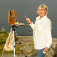
November 2017 Day 1 
3"x3" oil on acrylic primed paper

I'm using #5 for my 30 Paintings in November this month. I'll be painting a mini-painting every day, with the idea of saying a lot in a small format, and experimenting with composition, value, and color. I'm learning a lot already!

You can follow along with me on Instagram (@bobbiheathart) or Facebook (https://www.facebook.com/bobbiheathartist/). And if you aren't fond of those, I'll be happy to email them to you. Just let me know at bobbiheath@gmail.com that you're interested.

The collection will be available on December 1st for $35 each, which free shipping in the US for blog and newsletter subscribers.

Friday, October 13, 2017

The Oxford Comma of Painting

Sky Before Sunrise
6"x8"oil on canvas
Black paint was used in this sky.

You may never have heard the term "Oxford comma", but you've likely seen it many times. It's the second comma in the phrase "red, white, and blue". Also called the serial comma, whether to use it is a matter of personal preference. You can read more about the pros and cons here. Recently overhearing a conversation about the comma, I started to think about what is a similarly controversial topic in painting, of which I'm sure there are many!

The topic I came up with is whether to include black paint on your palette, or to mix your blacks from other colors. Once again, this is a matter of personal preference. Those on the pro side include the tonalists, who use black to limit chroma, even in their skies. Deborah Paris' online class "The Painted Sky" is a great way to learn this approach. I painted the top example in that class. Black is also commonly used with various yellows to make greens. Of course there is more than one black paint on the market. The most common are Mars black, Lamp black, and Ivory black. Mars black is made from iron oxide, Lamp and Ivory black are made from carbon. The later are somewhat transparent and slow drying, the former is opaque. For more information look here and on wetcanvas.com. I've read comments online as to which of these blacks is more warm or cool, but it sounds like the variations between the manufacturers may swamp this. The bottom line is you'll have to try them for yourself.

Sternman 
16"x20" oil on canvas
There was no black paint used in this painting.

On the con side, black paint is said to dull or kill whatever it's mixed with, and thus mixed darks, lacking this characteristic, are preferred. Some popular combinations are burnt sienna or burnt umber with ultramarine blue and alizarin crimson with viridian. If you're willing to mix three colors, there are many possibilities. Personally I like transparency in my darkest darks, so burnt sienna and ultramarine blue work well, and can be mixed to a strong black. And I use ultramarine blue and cadmium red medium with differing small amounts of cadmium yellow medium when I want to steer the mix towards dark purple (least cad yellow), dark red, dark blue, dark green, or dark brown.

And finally, there's another option, Gamblin's Chromatic Black, a mixture of their quinacridone red and phthalo emerald, which "gives painters a dead-center black with life to it and a clean transparency". This one is my preference for black and white value studies.

Friday, September 29, 2017

Style is in the Process

Last week I had the pleasure of visiting New York city to see my cousin perform on opening night in the Broadway play "The Play that Goes Wrong". Amelia McClain is a star! What a fun night of theatre!

On my last day in the city I visited a dozen galleries in Chelsea, and did I get an eyeful. As you can probably guess, much of what I saw was abstract, or at least abstracted. And there were several that caught my eye.

At the UNIX Gallery, I fell in love with "Something Surprising" by English artist William Bradley. I love the white negative space, the colors, and the composition in general. I was told that Bradley first mocks up his ideas in water color in a small format and then translates that onto the larger canvas.


William Bradley
Something Surprising
Oil on canvas

79 x 55 in | 201 x 140 cm
2016

Courtesy of William Bradley and UNIX Gallery

At the Morgan Lehman Gallery I was intrigued by the work of Tim Bavington, whose current work is inspired by music. The vertical bands of color represent melody, beat, etc., in the particular piece of music, translating aural experiences into visual ones. The gallery has examples of both the initial watercolor on paper and larger synthetic polymer on canvas pieces as well as archival ink jet prints. I particularly enjoyed seeing the pieces where the artist had tested the synthetic polymer colors against the watercolor or ink piece.

Tim Bavington
Study for Highway 61 (Revisited)
Archival ink jet print with synthetic polymer
25 x 24 in | 63.5 x 60.96 cm
2017
Courtesy of Tim Bavington and Morgan Lehman Gallery

Tim Bavington
Between the Lines of Age
Synthetic polymer on canvas
48 x 48 | 121.92 x 121.92 cm
2014
Courtesy of Tim Bavington and Morgan Lehman Gallery


At the Kim Foster Gallery I found a new twist on encaustic painting. Christian Faur uses crayons, pointy ends sticking out, to create beautiful large mosaic paintings. He uses the handmade crayons like pixels, arranging tens of thousands of them to create each painting. Think painting, Pointillism, and digital photography all rolled into one. There were other types of Faur's work in the exhibit, including portraits in a more classic encaustic style, though you could see the melted crayon shapes. I thought these were also fabulous.


Christian Faur
Peonies
43,680 hand cast encaustic crayons
20 panels, 55 x 69 
2017
Courtesy of Christian Faur and Kim Foster Gallery 

While the finished work of each of these artists is compelling, it's the process that grabs my attention. And it's the process that makes them unique. When most of us think of process, we think of how the paint is applied, the steps used to create layers (or not), how the drawing is created on the support (or not), etc. But these artists are going one step further, or starting a few steps earlier, and using their medium in a new way (Faur's crayons), gathering inspiration and structure from an auditory experience (Bavington), or prototyping the work in a different medium (Bradley). We are probably more familiar with Bradley's approach, since many of us were taught do a value sketch before we paint. His was the first work to attract my attention (I won't tell you about all the paintings that didn't reach out to me AT ALL). And it was a great introduction to the more abstracted processes of the other two. Yes, I think you can abstract the process, not just the subject matter! I'm using abstracted here to describe the simplification of the process into a structural/design phase and an assembly phase. The brain work is in the design phase, though careful assembly is required.  My little foray into abstract art in Chelsea has left me with a lot to think about as I continue the journey of abstraction in my own work.

While I usually show some of my own work in each blog post, I won't attempt that in this one. If you'd like to get a daily view of my work, take a look at my Instagram or Facebook page.

You can sign up to have posts on this blog emailed to you on the right hand side of this page.

And for periodic announcements, free art goodies, and special offers, sign up at the bottom of this page.


Tuesday, September 19, 2017

Sunflower Time!

I've gone a bit sunflower mad.

Three Sunflowers 8"x8" acrylic on treated paper

Sunflowers are one of my favorite painting subjects. There's so much to them, they're "chunky", in that there are lots of shapes and angles, and they have mass and weight. And bright colors too. There's a lot to love about a sunflower. I'm not the only artist that as loved them, Van Gogh sunflowers, anyone?

Vincent Van Gogh - Three Sunflowers

I've been using sunflowers this month as a way to learn a few things. One of them is how to make a time lapse video. Another is to play with abstraction in my painting. To do that I'm experimenting with acrylics. Well, to be honest I've painted sunflowers with oil, acrylic, and pastel in the last few days. It's so much fun to stretch my wings!

Sunflowers in gouache from a few years back

But the most exciting sunflower adventure I've had was visiting a field of sunflowers in eastern Massachusetts. Wow! Colby Farm is something else. You can wallow in sunflowers there. I was interested to find on a late afternoon visit that the flowers were not facing the sun. In fact the leaves of the sunflower follow the sun by a process called heliotropism, but only the budding flowers do this. Once the flowers are mature the stem stiffens and they always point east towards the sunrise. I was rewarded one morning last week by sunflowers awash in light.

Sunflowers in the Morning
8"x8" oil on canvas 
for videos of the sunflowers at Colby Farm see below

If you want more sunflowers, there are lots of them (including videos of Colby Farm) on my Instagram, along with a selection of my sunflower paintings. I've spent the last few weeks re-launching my Instagram presence, which includes beautiful images of paintings, studio shots, my new demo videos, and what I'm working on "right now". I'd love to have you follow me there. You can do that on your phone with the Instagram app, or online at instagram.com/bobbiheathart.


Saturday, July 29, 2017

Always Design First

 Seal Ledge 1

Seal Ledge 2

Seal Ledge 1 Thumbnails

Seal Ledge 2 - Thumbnail

You might think that when you're at a plein air festival and you've only got two and a half days to paint six paintings, that you should just get right to it, and skip doing a thumbnail in your sketchbook. You couldn't be more wrong. The most important thing in this situation is to not make mistakes, because do-overs take a lot of time. I tried to remember this last week at the Castine Festival. Above are two paintings that I very much enjoyed doing, because I love the structure of the subject matter and because I was able to stand in the shade!

Coming up with three thumbnails for the first painting only took about 5 minutes or so, and from those three I was able to move the trees around and design a new scene for the second painting the next morning. What a time saver!

Wednesday, July 26, 2017

No One Will Steal Your Chair

 A tale of two events on the same Maine weekend 


Chairs lined up for last Friday's Yarmouth Clam Festival Parade
No one will steal your parade chair at the Yarmouth Clam Festival. Even if you put it out on the sidewalk two weeks ahead of time. It's a tradition, everyone stakes their claim and no one messes with the process.
Yarmouth has held its Clam Festival annually since 1965.  The festival food booths are put on by local non-profit organizations to fund their activities. My favorite is the pancake breakfast at the Congregational Church. There's an impressive parade, fireworks, live music on three stages, clam shucking contests, a firefighter's muster, fine arts and craft shows, a bike race, and a carnival and midway. People come from miles around every year for the festival.
I've been to the festival many times, but the last few years I've missed it. That's because my favorite plein air event of the year is on the same weekend, and it's 85 miles away in Castine, Maine. The clam fest had another successful year in 2017 and so did the Castine Plein Air Festival. I thoroughly enjoyed it!
Fuel Dock - 8"x10" oil on Raymar panel
One of the best things about this year's plein air festival was the buyer's stories about what drew them to each painting. I spent a lot of time painting at one of the boatyards this year, and enjoying the scenery and the welcome shade. I love painting in boatyards, they are kind of my comfort zone. This was my first painting and I almost ditched it part way through. I'm so glad I persevered (thank you for your encouragement, Carol). It went to the boatyard owner's wife, who sent her father on a mission to find it.
Holbrook Ledge - 6"x8" oil on Raymar panel
I painted this one on the first day as well, in a shady spot at Fort Madison, at the entrance to Castine Harbor. The Guildive, a local ketch, oblidingly glided by in the distance three times, so that I was able to sketch it a few times and put it into the painting. At these festivals you aren't' allowed to use any photos, it all has to be done by eye. The buyers love this view, which they can see from their house. They kept bringing people by my table at the show to see their find. The art lovers of Castine are a very appreciative and lovely group of people.

If you'd like to learn more about the Castine Plein Air Festival, here's a post I wrote in 2015 that describes the town and all the fun you can have there.
Tomorrow is my last week of co-hosting the Artists Helping Artists Show with Leslie Saeta. It's been such fun and I've learned so much! If you'd like to listen to the shows, they're available as a podcast on iTunes and on Sticher. The shows have been "How to Use Lists to Organize Your Art", "What we can Learn From the Top Rated Artists Blogs", "It's Time to Organize Your Mailing List". And tomorrow's show is about what you can give away to boost your art business. You can join us here live at 9AM.

Thursday, July 13, 2017

Flattening the Landscape


There's a problem with this painting (OK maybe two problems). The first problem came to my notice when I sent a photo off to friend. She thought that there was a meadow in front of the trees on the right. Hmmm, it's supposed to be clumps of small plants floating on the water. Smaller than lily pads, bigger than algae. I asked myself why it doesn't look right. And to aid in the analysis, I went back to the scene, got out my trusty grid on plexiglass, and did a quick outline on top of the grid of what I was seeing.

Despite the fact that the reflection is different (it wasn't as windy this morning as when I painted the piece), it's pretty easy to see the problem now. The floating plants on both sides take up too much space vertically. They need to flatten out. I decided that those on the left weren't too bad (even if they don't look like the drawing on the plexiglass) and focused on the right side.


Above I wetted the dry painting with solvent and redrew the shape of the clump of plants in ultramarine blue.


And then I repainted the reflection on the right and added a few floating clumps in front to enforce the idea. I hope it looks more like floating plants to you now.

The plexiglass grid is an excellent tool to tell you when your drawing has gone wrong. And one of the most common ways drawings go wrong in landscape painting is when we are attempting to show a horizontal surface receding into the distance. Marsh paintings are particularly problematic. When this goes badly wrong, we appear to be hovering over the scene rather than looking into it.

You can make a plexiglass grid very easily. You'll need a piece of plexiglass from the hardware store. At my store they were happy to cut it for me. You'll also need a Sharpie permanent marker pen to make the lines and a ruler. You'll want a dry erase pen for drawing your scene, so that you can erase it. I made a bunch of these for my students in my recent drawing class and they've been put to good use.

To use the grid, you first need to check the aspect ratio. My plexiglass grids are 6"x8", so for this 8"x10" painting, I marked off a quarter of an inch on each side, making the grid 6"x7.5" (an 8x10 aspect ratio). Hold the grid in front of you until the view is enclosed by the grid. Holding steady, quickly sketch the shapes. Now move the grid back and forth in front of your painting until the painting fills the grid. Now you can see where your drawing has gone awry.

And actually, you don't need the grid if all you're trying to do is see whether your drawing has any issues. The plexiglass itself with the dry erase marker will do the trick. But the grid can be helpful in laying out your drawing, and in seeing whether your horizon is straight and whether the sides of buildings are vertical. And of course, it's better to do this at the drawing stage instead of painting over a problem.

The second problem is the slash of sky reflection in the water, it's a bit crooked. I think I fixed it well enough.


Wednesday, July 5, 2017

Demos Are Fun

Clouds Over Harbor Island
9"x12" oil on canvas panel
Windjammer Days 2017

Doing a demo is a great experience for an artist. It's a bit intimidating the first time, but once you realize that people are really interested in the process, not looking for a masterpiece, and will ask interesting questions, it's a lot of fun. I've set myself a goal of doing four demos this year, in addition to the small ones I do while teaching. Last week was my second, so things are on schedule.

Carol L. Douglas, Ed Buonvecchio, and I were among the artists demo-ing at Boothbay Harbor's Windjammer Days last week. We were fortunate to be able to set up across the harbor from the main part of town, where we had a sensational view of not only the passing windjammers, but the moored lobster boats and Harbor Island. We were in Fisherman's Memorial Park, in front of the Our Lady Queen of Peace church, which dominates the skyline of that side of the harbor. We had lots of visitors, and lots of explaining to do. I particularly enjoyed Carol and a young man who helped her identify each of the windjammers. Not that she needs much help, she's a regular at the boatyard where several of them live. I was busy mentoring his older sister, who wants to be an artist. It is so much fun to take our work out to where people can see it happening, and help them understand the process.

 American Eagle sails past a tug
Photo courtesy of Carol L. Douglas

 Carol paints the island
Photo courtesy of Annette Koziel

You may ask why we didn't paint an actual windjammer. It's much easier to demo something that sticks around for a least a few minutes, which the windjammers did not. The point is to be there for the people, not to paint the technically most difficult subject you can find. But it was tempting...

I love painting in this particular spot. The island is what the word picturesque was meant to describe. I've painted it before and will likely again.

Harbor Island
5"x7" oil on gessobord
painted in 2010

And before I go, I'm excited to tell you that I'll be co-hosting the Artists Helping Artists blogtalk radio show this month with Leslie Saeta. It's such an honor to do this, and I'm thrilled. I have learned so much from this show over the years. Though the focus is on art marketing, there have been many shows interviewing artists and people who artists depend on. One of my favorites was the interview with Robert Gamblin of the Gamblin paint company. If you aren't familiar with this show, do check it out. The archives are a real treasure trove for artists.

You can listen to the show live, or to past shows which are all archived, at the link below.
http://www.blogtalkradio.com/artistshelpingartists

And you can also listen to the AHA show, as it's called, as a podcast.

This week's show is "How to Use Lists to Organize Your Art" at 11AM tomorrow.


Monday, July 3, 2017

Happy 4th of July!

Fishin' on the Fourth 
8"x10" oil on canvas panel

The fourth of July is a big holiday in our neighborhood in Maine. One of our neighbors started a tradition years ago - a parade followed by a cookout. It's a blast. The kids decorate their bikes for the parade, everyone gets involved, and a nice loop is made around the neighborhood. There's even a beautiful old flag carried by its edges, a man on stilts, drummers, and a lady liberty.

The pledge of allegiance

Lined up and ready to go

 They're off!

I feel so privileged to live in a place where everyone gets along and can celebrate together.  This year, I take up the mantle of Lady Liberty from my friend Diana who just had her 85th birthday. I hope I can carry it off as well as she did.

Have an enjoyable fourth!


Wednesday, June 21, 2017

Meet the Press


Stonington Green 8"x16" oil on Raymar panel

This morning Carol L. Douglas sent me a link to an piece in the Bangor Daily News. And I'm thrilled to tell you that my painting, Stonington Green, was the image chosen to accompany the article on the upcoming auction to benefit the Maine Center for Coastal Fisheries.

As an artist, I'm regularly asked to contribute artwork to raise money for worthy causes. Usually I'm happy to do that. And it's particularly enjoyable when the cause is near and dear to my heart. That's the case here. Formerly the East Penobscot Resource Center, the Maine Center for Coastal Fisheries has a mission "to secure a sustainable future for fisheries and fishing communities in Eastern Maine and beyond". I hope that my paintings of lobstering and Maine fishing communities are documenting a way of life that will continue, and they are dedicated to that.

 My contribution to the 2016 auction, with Stonington in the background

But back to the auction. It's a very cool event. This August, in addition to their traditional decorative lobster buoys, like the one I painted last year, the auction will include paintings by some of my favorite Maine artists. And that's not all. Nautical experiences will be on the block as well. You can bid on a guided boat tour of Deer Isle-Stonington, one of the loveliest stretches of water anywhere; a course at the fabulous WoodenBoat School; a fly fishing lesson; a day on the water learning how lobstermen work; and the opportunity to be named in mystery novelist Katherine Hall Page’s next book. What a great line up!

To get all the details, check out the Bangor Daily News article here. And thank you, BDN and the Maine Center for Coastal Maine Fisheries, for using my painting in your story!

Monday, June 12, 2017

Painting Pets - As Good as a Dog Kiss

I’m not usually crazy about commissions, and a people portrait painter I am not. But I love to paint pets. There’s just something about animals that live with humans that is so lovable. The texture and color of their fur and the distinctive varieties of their head shapes really gives me something to hang onto in the drawing and painting of their portraits.

Troy 
8"x8" oil on Raymar panel

This is Troy, he’s my son’s younger rescue dog. He’s not quite two, and the most lovable guy you could ever meet. All he wants to do is play. And when it’s hot out, he droops after about a mile of walking. In the winter, the world is his snow cone.


Clara
8"x8" oil on Raymar panel

And this is Clara. She's about four, and she's the boss. Troy may tornado around and try to get her to play every minute he can, but when she says it's time to stop, he stops. She's one of the best trained dogs I've ever met, due to spending a year living with an expert trainer before my son adopted her. The two pups are quite a pair and lots of fun to have around.

There are a lot of good pet portrait painters out there, but there's one that I’d like to highlight. Paint Squared is the website of Elizabeth Fraser. Her pet portraits totally inspire me. She really captures the personality of her subjects, and her color, well it’s fabulous. I interviewed Elizabeth a few years ago and it was really fun to learn more abut her and how she works.


Pet portraits by Elizabeth Fraser


To create a great pet portrait you need a really good photo. Here are a few tips on how to take one from the references listed below.

- Use natural light, and make sure there are some shadows visible.
- Get down to their eye level.
- Get in close.
- Keep their eyes sharp, focus on them.
- Be patient, and take lots of photos. You can always delete the bad ones.

9 Pet Photography Tips
How To Take the Best Pet Photographs
How to Photograph Pets


Tuesday, June 6, 2017

A Successful Opening

My four beach girls paintings at Yarmouth Frame and Gallery
each 12"x12" oil on canvas in floater frames

I went to two exhibition openings this weekend, both of which I felt were successful. That got me thinking, what makes an opening a success? There are some basics, like great artwork of interest to those who live in the area, and pleasant, well-lighted surroundings. And of course, having the event publicized by the artists and the venues. Simple finger food and a little wine are also great. 


Teaming Up by Joelle Feldman at Yarmouth Frame and Gallery, Joelle also has paintings at the Wild Salamander show.

One thing that makes for a good turn out is having the artist(s) present, which was the case for both of the openings I was at this weekend. In one case, it was a show for four artists in the same medium, at a local art center venue, where they regularly have classes and workshops, and exhibitions by groups or individual artists. In this venue there are no “gallery artists”, though it’s such a lovely venue that I imagine there are artists who book it regularly. The other is a gallery that has a stable of gallery artists, and four or five openings a year. Both were very well attended.

The Wedding Tree by Lisa Regopoulos at the Wild Salamander Art Center

The shows were hung differently, but both effectively. In the case of the four artists, each artists work were separated into groups of two or three paintings, and the groups were distributed throughout the venue, so the viewer moved from one artist’s work to another and back again as they went around the three open rooms. Because the work was all in the same medium, it held together really nicely. And by the time I’d seen everything, I felt I could identify each artist’s work with ease. In the gallery case, the space was nicely divided by movable walls into a number of niches for viewing the artwork. Each artist’s work occupied one or more wall of one of the niches. This allowed for lots of hanging space, and easy movement of viewers between the different spaces.


Lobster Rafts at Dusk by John Bowdren at Yarmouth Frame and Gallery


How do you get people to linger, to chat with the artists and each other, and to really look at the artwork? In both cases, the artists were actively engaged in answering questions and discussing individual paintings with the visitors to the exhibitions. It was also very nice to see students of the various artists come to the shows, and great to chat with them.

All in all, I very much enjoyed both of these shows, discovered a few new artists whose work I love, and got a chance to discuss artwork, methods, framing, and upcoming workshops.

The two shows are open for a while yet, and very worth taking a look at.

Nature’s Delight at the Wild Salamander Art Center in Hollis, NH, through June 24:
http://www.wildsalamander.com/whitty_gallery.html

Rise and Fall of Light at Yarmouth Frame and Gallery, in Yarmouth, ME, though September: http://www.yarmouthframeandgallery.com


For more information about my paintings and upcoming classes and workshops, please visit my website.

Thursday, June 1, 2017

Stripes!

Stripes!
12"x12" oil on canvas

I've had fun painting the beach girls, and delivered four paintings of them on Tuesday to Yarmouth Frame and Gallery. You've now seen all but one. There will be an opening for the new show on Saturday from 4-7. I'm looking forward to it, since I missed the previous opening due to a snow storm. Please join us if you can. Yarmouth Frame and Gallery, 720 US One, in Yarmouth, Maine.

I've written before about the artists whose beach people paintings have inspired me, but I was also inspired while working on mine by a couple of printmakers working in silk screen (serigraph). Every year, I buy an Alan Claude Maine calendar, and I try to do it at the Portland Sidewalk Art Show, so I can say hello to Alan. I love his poster style Maine scenes, with their dimensional light and shadow and wonderful color. My one experience with planning a woodcut left me with an appreciation for the process of teasing a minimal number of colors and values out of the reference image. It's a bit like doing a puzzle. Here's an example of Alan's work:

 Lobstering at the Nubble by Alan Claude, serigraph print

Serigraph print by William Mitchell

Another serigraph artist I admire is William Mitchell, who works depicts New Hampshire's scenic beauty. While both these artists work mostly with landscape subjects, their work still influenced mine on the four beach scenes. I wanted to abstract the shadow on the turn of the girl's legs and faces into a set of values rather than blending them into a range. Once again the restriction to a discrete set of values/colors fascinates me! I have a set of cards that I bought from William at a Button Factory Holiday event a few years ago. I doubt I'll ever send one to anyone, because I just love to look at them.

To see all of my beach girls paintings, visit my website here.


Thursday, May 25, 2017

Your Art Collection


My Dream of Maine by Bobbi Heath
24"x24" oil on canvas

Have you been thinking about buying your first original painting? Or about growing your collection? There are lots of things to consider when buying a painting. I was recently interviewed by Adam Ziemba for an article on this subject, called 7 Expert Tips You Need to Know Before Purchasing Art.  I thought I’d give you a synopsis here. But first I'll show a few paintings I particularly like by some favorite artists.


 Rising Tide at Wadsworth Cove by Carol L. Douglas 
12"x16" oil on canvas

Bright Red by Joelle Feldman 
4"x6" pastel on sanded paper


 Winter Evensong by Poppy Balser
7"x11" water color

Bluebird Day by Suzanne deLesseps
14"x11" pastel on paper

Below are the seven tips I gave Adam. For more information on each tip, the article is here on Adam's website.
  • For me the most important thing to consider when buying a painting is that it speaks to me.
  • My husband and I buy artwork in galleries, directly from artists, and online.
  • When I buy my first painting from an artist, I like to see six or eight paintings by that artist to make sure the one I’m drawn to is consistent with their body of work.
  • Buying paintings online is a great way to have a variety or work to choose from, and many artists find it a very effective sales channel.
  • When considering a painting online, be sure that you understand the size of a painting.
  • If you find an artist you love and would like them to create a commission for you, don’t be afraid to ask if that’s a possibility.
  • Buying a painting is an investment in enjoyment, both for yourself and for your family.
For information on upcoming events, available paintings, and classes and workshops check out my website here.