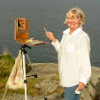
Next Wednesday evening is the opening of the Borestone Art Show at the Maine Audubon Gilsland Farm property in Falmouth. This will be a wonderful event, with paintings by all of last year's Borestone artists, of which I am one. Visiting the Borestone Mountain property with a wonderful group of artists and actually staying together in the lodge has been one of the most memorable of my painting experiences. A longer post will be needed to do it justice. I am honored to have been included and hope that my painting makes real money for Maine Audubon. This is my contribution, "Borestone Lodge" 12"X12" in oil, framed in a black/gold floater frame. I hope to see you all at the opening.
Thursday, April 30, 2009
"Borestone Lodge" and the Maine Audubon Art Exhibit
Next Wednesday evening is the opening of the Borestone Art Show at the Maine Audubon Gilsland Farm property in Falmouth. This will be a wonderful event, with paintings by all of last year's Borestone artists, of which I am one. Visiting the Borestone Mountain property with a wonderful group of artists and actually staying together in the lodge has been one of the most memorable of my painting experiences. A longer post will be needed to do it justice. I am honored to have been included and hope that my painting makes real money for Maine Audubon. This is my contribution, "Borestone Lodge" 12"X12" in oil, framed in a black/gold floater frame. I hope to see you all at the opening.
Tuesday, April 28, 2009
"Cove Road"
 At the end of Cove Road in Freeport is one of the town landings, and my friend Suzanne and I love to paint there, with beautiful salt marshes and water on three sides. We were there on Sunday, enjoying the wonderful weather, but the salt marsh is not very interesting at this time of year. There are no leaves yet, and the grass is packed down and gray. So we turned around and looked up the road. This is what we saw (oil 6"X6").
Sunday, April 26, 2009
Mini-show at the Yarmouth Frameshop


They've just hung these gouache still lifes (from earlier posts) at the Yarmouth Frameshop and Gallery on Main Street in Yarmouth. They are 5"X5" pieces matted and framed to 12"X12" and look really great with the natural edges showing. If you are in town, do go take a look. Mother's day is only two weeks away!
Tuesday, April 21, 2009
"North Haven" and the BBBS Auction - SOLD

 One of the things I love to do is contribute paintings to auctions for worthy causes. A very worthy cause is the Big Brothers and Big Sisters of Southern Maine. They are having their annual Bid for Kids Auction in Portland on Friday, May 8. This painting of North Haven Harbor is my contribution. The painting is done in oil on gessoed paper and is 11"x14" in the frame.
Monday, April 20, 2009
"Backlit"
 I can't resist oranges. I toned the canvas yellow for this painting, and liked the yellow against the orange, so I went with that and the purple shadow (6"x6" oil). I just love drawing these, especially now that Carol Marine taught us that the top of the half orange is always an ellipse square with the canvas, no matter in which direction that seam down the middle goes. Thank you Carol!
Friday, April 17, 2009
"Gilsland Spring" - October Painting Giveaway
 Gilsland Farm is a Maine Audubon property in Falmouth, ME. It is wonderful to have such a beautiful place so close to home. This is my favorite view, and I would like to paint it in all four seasons. From photos and a sketch last May, this is my version of spring (6"x6" oil).
Wednesday, April 15, 2009
"Mirror Mug" - August Painting Giveaway
 I keep finding things about this mug that I like; first the color, then the shape, and now this mirror thing. I think the photo enhances the mirror effect over the actual painting, where it is a bit more subtle. Sometimes the photography is harder than the painting!
Sunday, April 12, 2009
"Dinner"
 In honor of Spring we are having lamb chops for dinner. I couldn't resist painting one first. Funny how the chop just fell off the brush and the carrots were very difficult. Perhaps it is because it is easier for me to see the chop as just a shape with some areas of color, while those carrots really wanted to BE carrots. Happy Spring!
Saturday, April 11, 2009
"Saltmarsh Again"
 I thought it would be interesting to try painting the same subject in both oil and gouache. Here is the result, Saltmarsh, this time in gouache. A bit blockier and more contemporary than the oil version (see my April 5 post). I went for some verticals in the reflections and a less detailed background. Two different paintings, for sure.
Wednesday, April 8, 2009
"Aubergines" - SOLD

It is back to gouache again for these fabulous aubergines. When I saw them in the grocery store on Saturday, I knew I had to paint them. Just the right size and with nice stems and a beautiful color. This picture is from a scan rather than a photo, and the purple is not quite as red as in the painting. I am still experimenting with the best way to get a realistic reproduction.
Sunday, April 5, 2009
"Saltmarsh"

More experiments in painting the bright saturated colors first. For this painting (6"x6" oil) I toned the canvas with yellow. And it stuck. For contrast look at "Castine Field" in the previous post. Though I didn't tone the canvas on that one, I basically did the painting in a monotone blue and then painted into that while it was wet. I find that you can't get rid of whatever color you start with... Thanks to Suzanne deLesseps for the photo from which this painting was done.
Friday, April 3, 2009
"Castine Field" - SOLD
 It feels like spring and I am ready for landscapes, so I have been going through my photos, reminding myself of beautiful places. This scene comes from the lovely town of Castine, ME which we visited on our sailboat one summer. I used a photo from the trip as a basis for this oil sketch (6"x6").
Wednesday, April 1, 2009
"Blue and Yellow Don't Make Green" - NFS
 "Blue and Yellow Don’t Make Green" by Michael Wilcox is an excellent book that Carol Marine referenced in the workshop I recently attended. The book explains how pure primary colors simply don't exist and all of those that we can buy "lean" towards one of the other primaries. Thus to mix any color desired requires a palette of two of each primary, where for each primary we have one that leans each way. Carol pointed out that with this palette we can mix colors that contain only two of the primaries, which will result in bright or "saturated" colors. When all three primaries are included in the mix, even if one of them is in a small quantity, a duller unsaturated color results.
The painting above demonstrates this. The background color is made from phthalo blue (leans toward yellow) and lemon yellow (leans toward blue). Together they can make a saturated aqua color because neither leans toward (contains any) red, which would dull the combination. Likewise the flower colors are mixed from cadmium yellow (leans toward red) and cadmium red (leans toward yellow). Together they make a range of saturated yellows, orange, and red, that would not be possible if there was any blue in the mix. I could not have mixed both the background and the flower using the same yellow.
Now if I could just get this color knowledge and the change of color for each brush stoke idea together, I would really have something!
Subscribe to:
Posts (Atom)